LAIKA is neither bold nor thin, but swings between these extremes. Its form is no longer defined statically, but alters dynamically. As well as the font’s weight, its contrast, serif lengths and italic angles all shift dynamically.
All these parameters can be driven and influenced by a range of inputs, in order to create a typeface that changes constantly in real time.
LAIKA requires a whole new, dynamic understanding of typography.
Why should a typeface be rigidly set, if it is not going to be printed? In a dynamic medium, why shouldn’t the form and the character of the typeface be understood dynamically as well? Why shouldn’t its forms change, transform, and respond to circumstances?
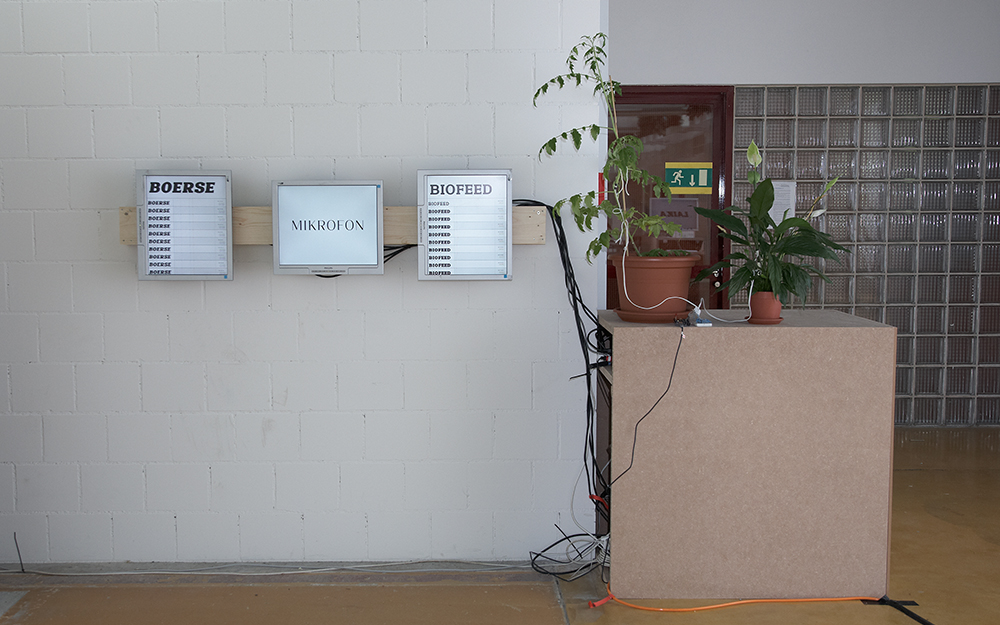
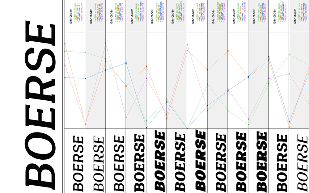
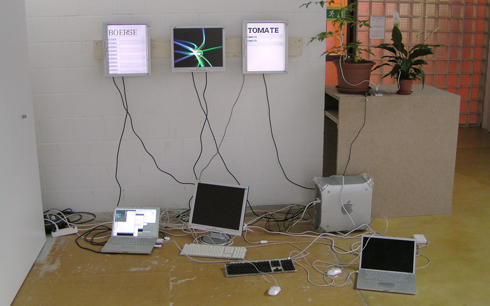
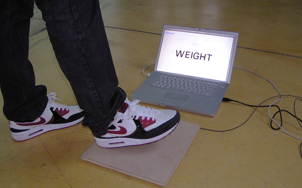
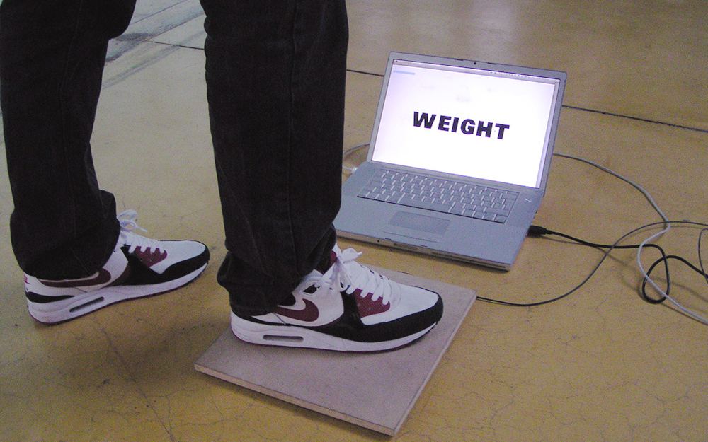
Prototypical applications show their potential in combination with interactive, audiovisual inputs, data requested from the Internet in real-time (RSS feeds), and electronic components such as sensors or simple switches. In this way, an advertising text could react to passers-by, stock market prices could influence a corporate typeface, or ECG measurements taken while writing could breathe new emotional life into digital love letters.
With LAIKA, there is finally a font that can seamlessly use the whole spectrum of its cuts. A font that is able to move between its extremes in real time. An interactive font that is able to respond to its surroundings. A font that questions deadlocked dogmas and throws up completely new design questions, and thus has the potential to revolutionise the understanding of digital typography.
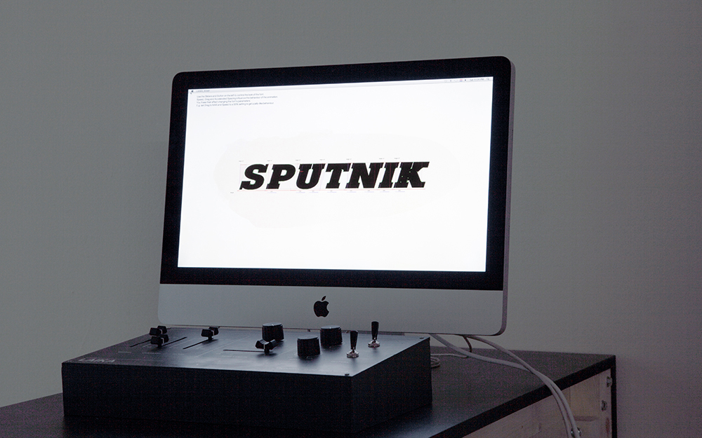
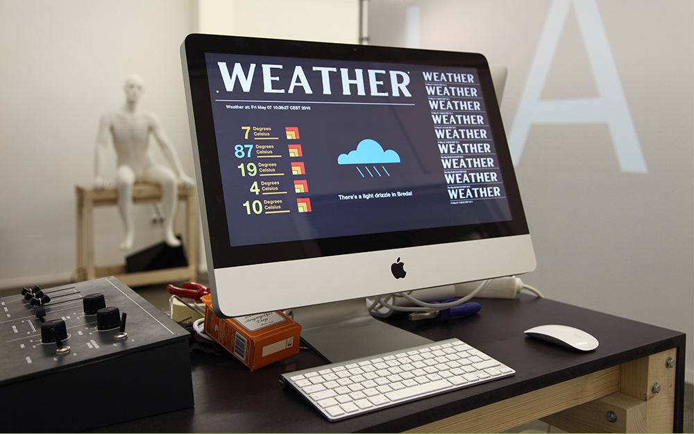
Various installations